10 Common Web Design Mistakes Small Businesses Make and How to Avoid Them
In today’s digital landscape, your success heavily relies on your online presence. A well-designed website isn’t just a luxury for small businesses—it’s a critical tool that can determine whether a company thrives or struggles. Your website often serves as the first point of contact for potential customers, and making a positive first impression is key to converting visitors into loyal clients and customers. However, many small businesses fall into common web design traps that can hinder their ability to capitalize on their online potential. Identifying and fixing these mistakes is crucial to ensuring your website works for you, not against you. Here’s how to avoid these pitfalls and optimize your site for success.
1. Ignoring Mobile Responsiveness
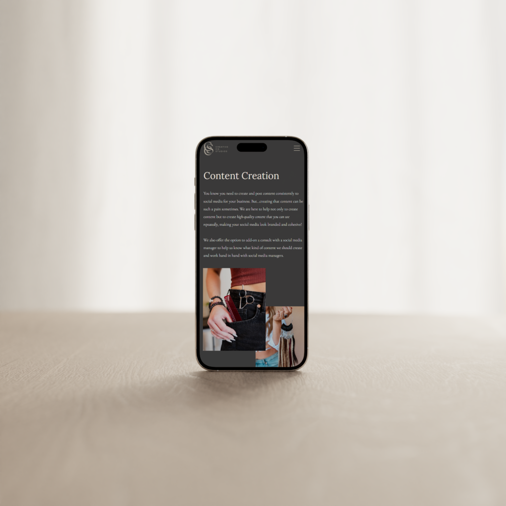
With mobile devices accounting for a significant portion of global web traffic, having a non-responsive website can severely impact your business. If your site isn’t optimized for mobile viewing, you risk alienating a large segment of your audience, leading to decreased user engagement and lost sales opportunities.
Solution: Implement a responsive design that automatically adjusts the content, images, and layout based on the user’s device. This ensures a seamless experience whether visitors are browsing on a smartphone, tablet, or desktop. Regularly test your site on various devices and screen sizes to catch any potential issues before your customers do.
 2. Complicated Navigation
Navigation is the backbone of your website’s usability. If users can’t easily find what they’re looking for, they’ll likely become frustrated and leave. Complicated menus, too many options, or inconsistent navigation paths can confuse visitors and drive them away.
Solution: Simplify your navigation by reducing the number of menu items to the essentials. Clearly label each menu item to reflect the content it links to, and organize your menu in a logical hierarchy. Consider using a “mega menu” for larger sites with multiple categories to keep everything accessible without overwhelming the user. Limiting the number of submenu levels also helps to prevent users from getting lost.
3. Overloading with Text
Walls of text can be overwhelming and off-putting to visitors. In the age of short attention spans, users are more likely to skim content than read every word, making it essential to present your information in a way that’s easy to digest.
Solution: Embrace white space to give your content room to breathe. Break up long paragraphs with bullet points, subheadings, and visuals to make the information more accessible. Infographics, images, and videos not only add visual interest but can also help convey complex ideas more effectively. Remember, less is often more when it comes to web content—focus on clarity and impact over quantity.
4. Underestimating the Footer
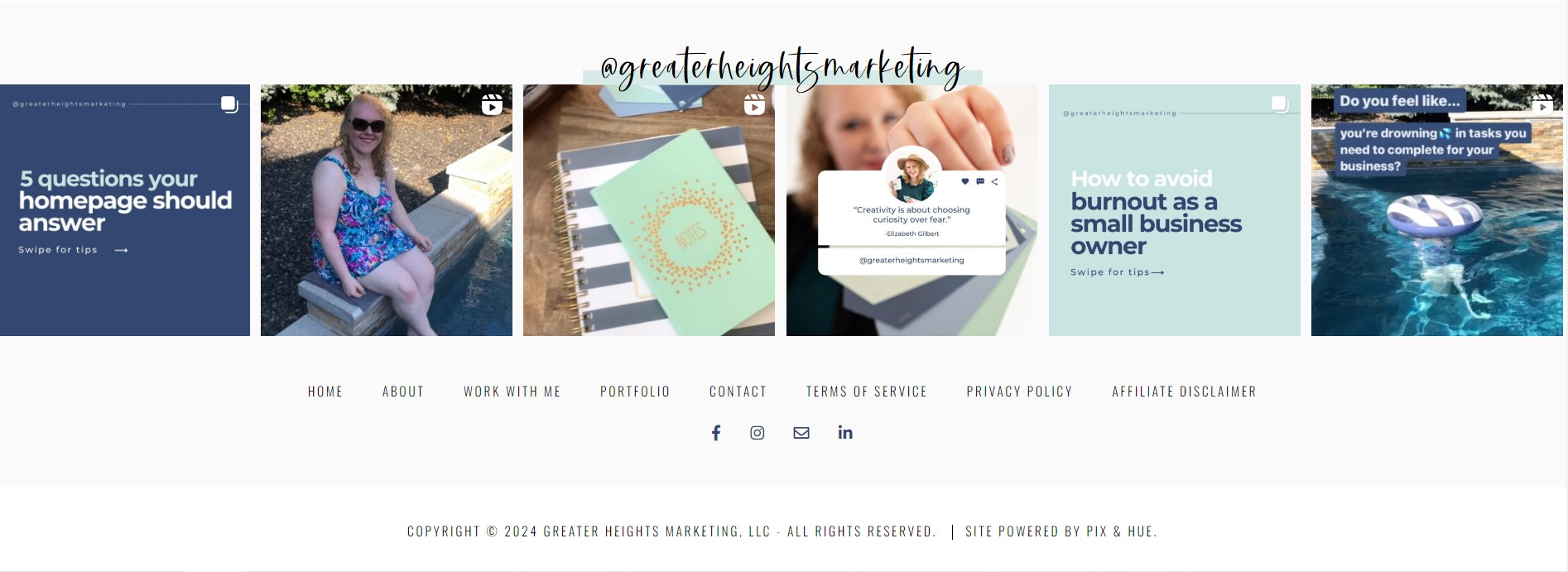
The footer of your website is often overlooked, but it plays a critical role in user engagement. As the last section of your site that visitors see, it’s your final opportunity to guide them to important information or encourage further interaction.
Solution: Make the most of your footer by including links to essential pages, such as contact information, privacy policy, and terms of service. Add shortcuts to your social media profiles, a brief about your company, or a newsletter signup form. This space can also be used for a quick navigation menu or links to recent blog posts. A well-designed footer can enhance user experience and keep visitors engaged even as they reach the bottom of your site.

5. Poor Use of Colors and Fonts
The visual design of your website—specifically your choice of colors and fonts—plays a significant role in how visitors perceive your brand. Colors that clash or fonts that are difficult to read can detract from the overall user experience and even cause visitors to leave your site prematurely.
Solution: Choose a color palette that aligns with your brand’s personality and is easy on the eyes. Your primary colors should be consistent with your branding, while accent colors can be used to highlight important elements like buttons and CTAs. When it comes to fonts, opt for styles that are professional and legible across different devices and screen sizes. Ensure that there is a good contrast between your text and background to enhance readability.

6. Lack of Call-to-Action (CTA) Buttons
Call-to-action buttons are vital for guiding visitors through your site and encouraging them to take specific actions, such as making a purchase, signing up for a newsletter, or contacting you for more information. Without clear CTAs, visitors may not know what steps to take next, leading to lost opportunities.
Solution: Identify the primary actions you want users to take on each page and design CTAs that are clear, compelling, and easy to find. Use action-oriented language like “Buy Now,” “Get Started,” or “Learn More” to drive engagement. Position your CTAs strategically on the page, and make them stand out with contrasting colors and prominent placement. A/B testing different CTA designs can help you determine what resonates best with your audience.
7. Ignoring SEO Best Practices
Search engine optimization (SEO) is essential for driving organic traffic to your website. Without it, your site might struggle to appear in search engine results, making it harder for potential customers to find you.
Solution: Optimize your site with targeted keywords relevant to your business and industry. This includes using keywords in your page titles, meta descriptions, headings, and throughout your content. Don’t forget about on-page SEO elements like alt text for images and internal linking. Regularly updating your content and ensuring that it’s valuable and relevant to your audience can also help improve your search rankings over time. Tools like Google Analytics and Search Console can provide insights into your site’s performance and help you make data-driven decisions to enhance your SEO strategy.
8. Slow Loading Speed
In today’s fast-paced world, users expect websites to load quickly. A slow-loading site not only frustrates visitors but can also negatively impact your search engine rankings and increase your bounce rate.
Solution: Optimize your website’s performance by compressing images and videos to reduce their file size without sacrificing quality. Minimize the use of heavy scripts and plugins that can slow down your site. Use a content delivery network (CDN) to distribute your site’s content more efficiently and improve loading times for users around the world. Regularly test your site’s speed using tools like Google PageSpeed Insights and follow the recommended guidelines to address any performance issues.
9. Not Showcasing Testimonials and Reviews
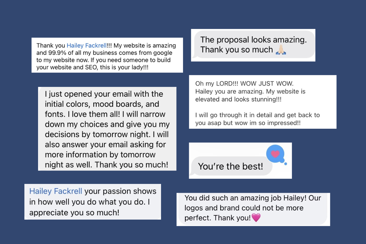
Social proof is a powerful tool in building trust and credibility with potential customers and clients. Testimonials and reviews provide real-world validation of your products or services and can significantly influence purchasing decisions.
Solution: Feature positive customer feedback prominently on your site, particularly on your homepage, product pages, and near CTAs. Video testimonials can be especially effective, as they offer a more personal and engaging way to showcase customer satisfaction. Encourage satisfied customers to leave reviews and make it easy for them to do so by integrating review platforms or providing a simple form on your website.

10. Inconsistent Branding
Consistency is key when it comes to branding. An inconsistent look and feel across your website can confuse visitors and dilute your brand’s message. Every element of your site should work together to reinforce your brand identity.
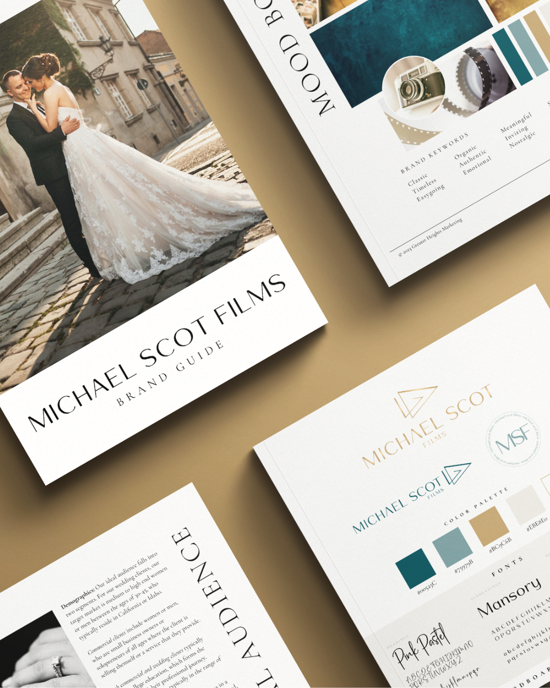
Solution: Develop a comprehensive brand style guide that outlines your color palette, typography, logo usage, and tone of voice. Ensure that every page of your website adheres to these guidelines to create a cohesive and recognizable brand experience. Consistent branding helps build trust with your audience and makes your business more memorable in a crowded market.
By proactively addressing these common web design mistakes, you can create a more effective and user-friendly website that drives engagement, builds trust, and ultimately leads to higher conversion rates. Remember, your website is not just a digital brochure—it’s a dynamic platform that should reflect your brand’s values and serve as a powerful tool for growth. Each element, from design to content, plays a critical role in shaping the user experience and guiding visitors toward becoming loyal customers. Invest the time and effort into getting it right, and your website will become one of your most valuable business assets.
Hailey Fackrell
Hailey Fackrell was born and raised in Boise, Idaho. She has a passion for helping small businesses soar to greater heights. Hailey believes in the power small business owners have to be change-makers and make a difference in the world around them. She graduated with her Bachelor of Business Administration in Marketing from Boise State University and currently has certifications in Google Ads, Google Analytics, Email/SMS Marketing, Digital Marketing and SEO. In 2021, she combined her love for creativity and design and founded Greater Heights Marketing, LLC and now helps small businesses stand out through unforgettable web design, branding and workshops.
